
Daniel Roth – the Man, the
Brand and the Watches,
part 1
It’s time to talk about the brand's most important features – why we value the brand and its watches so much
The name of Daniel Roth, a remarkable watchmaker and founder of an equally remarkable brand, means a great deal to modern watchmaking. At the height of his career in the second half of the 1990s, he was very loud, then, after the brand ceased operations, he largely disappeared from the limelight of the watchmaking community, making the watches of the brand he founded a classic collector’s item. And not just because the subject is closed, as Daniel Roth brand watches have been discontinued, but mainly because of the unique style the master craftsman developed, the constellation of great movements he created and the first-class workmanship we find in Daniel Roth brand watches.
Time for Breguet
But let’s start from the beginning. Daniel Roth comes from a family of watchmakers in Nice, France, and he decided to become a watchmaker himself. After completing his training at a watchmaking school, he nevertheless went to perhaps the best region for this craft – the Swiss Vallée de Joux, which is rightly called the Valley of Watchmakers. After working for Jaeger-LeCoultre and seven years at Audemars Piguet, he took a risky gamble in 1973: he accepted an offer from Parisian jewelers Jeanque and Pierre Chaumet to work for them on the revival of the Breguet brand.
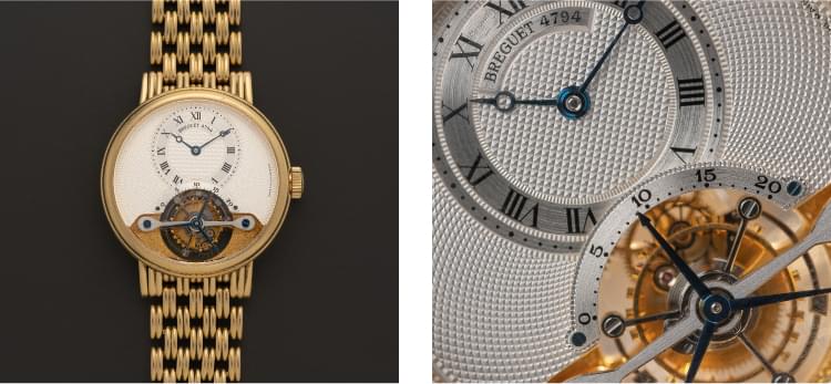
Breguet was not in the best of shape at the time and was living off a single store in Paris. Looking back today, many decades later, at what the brand has become, it is clear that Daniel Roth’s role was extremely important, even though half a century has passed since then. It is perhaps to him that the brand owes its understanding of the importance of the unique Empire style that the founder of the Breguet brand once created. Daniel Roth brought this style together and essentially created the brand’s DNA with an Empire-style case, a fluted caseband, ‘Pomme de Breguet’ hands and a guilloché dial – what we call the “Breguet style”.
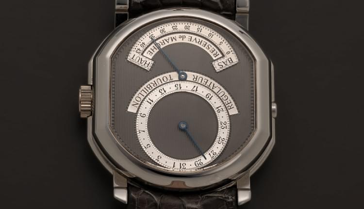
Daniel Roth, together with François Bodet, the then General Director of Breguet from 1972 to 1987, and Louis-Maurice Caillet, a prototypist of the brand, created the fundamental designs that still characterize the style of the brand today – these certainly include models such as the Quantième Perpétuel Ref. 3050, Réserve de Marche Phase de Lune Ref. 3130, Chronograph Ref. 3230, Day-Date Moonphase Ref. 3330 and Tourbillon Ref. 3350.
It seems as though Mr. Daniel Roth was a very capable apprentice to Abraham-Louis Breguet, one of the greatest watchmakers in the history of watchmaking. In 1987, when Chaumet’s core business fell victim to the fall in diamond prices and the Breguet brand was taken over by the Bahraini company Investcorp, Daniel Roth began to think about creating his own brand. It is interesting to note that he initially patented two versions of the brand name in 1987: D. Roth and Roth. A year later, in 1988, he seemed to have finally settled on the name of his own brand when he patented his full name, Daniel Roth. He launched his brand in 1988 with the financial backing of Siber Hegner, an international distribution and marketing group based in Zurich with deep roots in the Asia-Pacific region (now known as DKSH, or Diethelm Keller Siber Hegner).
Style and DNA of Daniel Roth
When Mr. Roth founded his own brand, he benefited greatly from his successful experience with the unique style of the Breguet watch collection. This is clearly evident in the Daniel Roth watches produced from 1989 until his departure from the brand he founded in 2001. Looking at many watches from this period, I would say that the Daniel Roth of the 1990s is not a repetition of the Breguet style, but its best innovative interpretation. This also includes how clearly and consistently the design codes of the Daniel Roth watches were defined – entirely in the spirit of Abraham-Louis Breguet.
First,
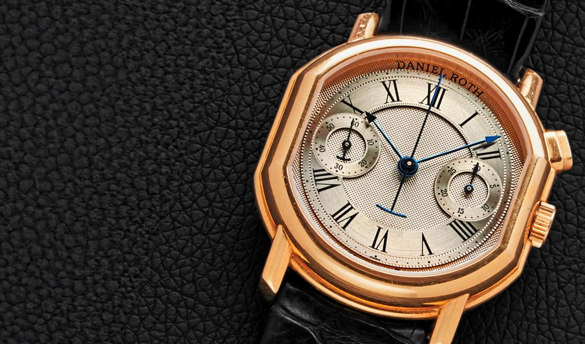
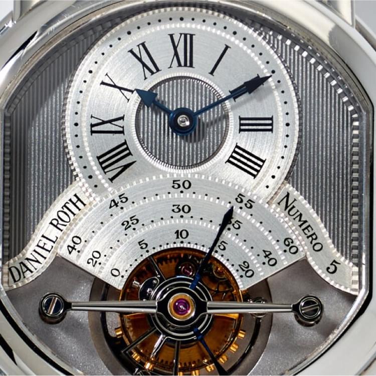
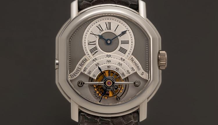
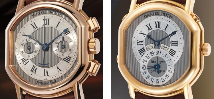
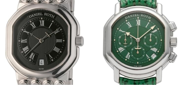
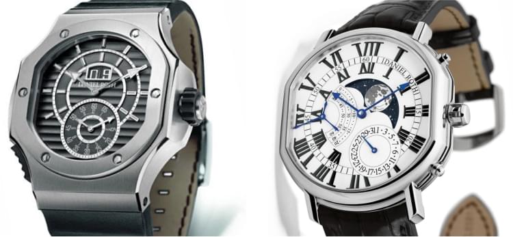
it is a uniquely shaped case with straight sides and a double arch – top and bottom. The style of the case can be described as Empire, with a clearly protruding caseband with a rounded profile and a symmetrical bezel and caseback both also rounded. Obligatory additions are straight, sloping lugs with a rounded upper part and a cylindrical crown with straight knurling. The case design is often referred to as a “double ellipse”, but this definition does not seem to be justified from a historical point of view, nor does it correspond to the shape of the case. Believe me, the geometric figure of the ellipse has nothing to do with the shape of the Daniel Roth case (nor with Patek Philippe’s Golden Ellipse). Rather, the Daniel Roth case is a double-arched case, or a double arcade if Lange had not staked out that name.
Secondly,
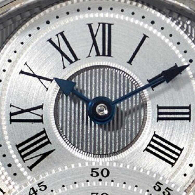
there is the guilloché dial, which is predominantly two-tone, with a dark ruthenium coating and a natural white gold tone (as long as Daniel Roth watches had solid white gold dials), a clear departure from the Breguet style, which is predominantly monochrome and silvered. Mr. Roth initially chose two guilloché patterns to decorate the dial: a Ligné, which is strongly associated with early Daniel Roth watches, and a diagonal Clous de Paris, which is also a basic pattern on many Breguet watches.
Thirdly,
the blued steel hands with clearly accentuated triangular tips and the characteristic T-shaped counterweight for the seconds hand, or two seconds hands if it is a chronograph watch.
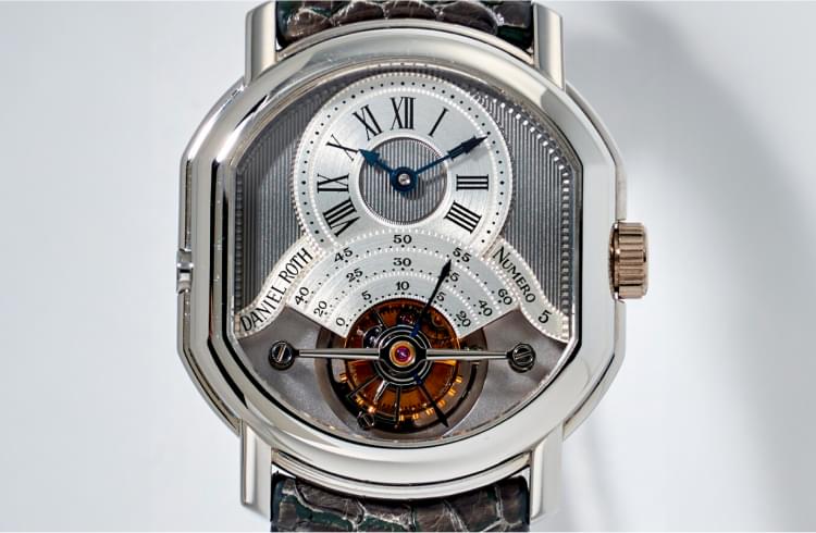
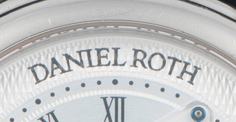
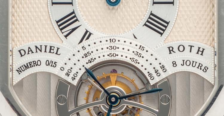
In addition, Mr. Roth’s early watches also feature some unusual design solutions that testify to his keen eye. For example, in the earliest tourbillons of his watches with this complication, and in some other watches created without his involvement, we always find a triple seconds hand, with three blued steel wings of different lengths sliding over three sectoral seconds registers – we find the same in the Tourbillon Suscription of 2024, which was the first watch introduced by the revived brand. This small detail has suddenly become so important that, together with the double-arched case, it is perceived as the brand signature.
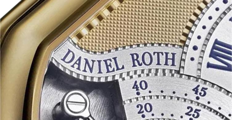
Another unique invention by Mr. Roth is the design of the dial of the Tourbillon Ref. 187 and 186, namely the part that adjoins the open part with the tourbillon. It looks like bat wings or a symbolic image of a royal robe. It consists of a solid central part with a triple sector of the seconds track and two wave-shaped cartouches (all parts with a meticulously guilloché “filet sauté” contour!), on which the brand logo and the watch number are depicted. The earliest logo seen on a Daniel Roth watch has an extravagant wave shape – it is very bold and amazingly charismatic in design. It definitely took first place in the watch logo competition I just made up.
Thanks to these design codes, Daniel Roth watches are instantly recognizable, and this recognizability is reinforced by a very important factor for a true connoisseur and collector – the high class of the movements and the excellent finishing. In general, the DNA of Daniel Roth has proven so strong that even in an incomplete and modified form, it still defines the esthetics of the brand’s collection – until now, when the LVMH Group, the current owner of Daniel Roth, announced plans to relaunch the brand. Fortunately, not from scratch.
Unfortunately, Mr. Roth’s excellent taste and ability to design extremely attractive watches could not match his ability to run a profitable business. His period of independence did not last long – as early as 1994 he sold the majority of shares in his brand and – unfortunately – his name to the Singaporean retail group The Hour Glass, Daniel Roth’s most important retail partner in the strategically important region of South East Asia. The subsequent global economic crisis of 1998 forced The Hour Glass to rethink its plans for the watch brands it owned, and in 2000 Daniel Roth was sold on, along with the Gérald Genta brand, to the Italian Bulgari Group. One of the conditions of the deal was the sale of all one hundred percent of the company shares to the new owner, so since 2000 Daniel Roth no longer owned even a small part of the company he had founded and decided to leave it. Bulgari ran the brand as an independent company for a decade and finally decided to dissolve it in 2010, although the brand’s DNA was still used in the Daniel Roth by Bulgari collection watches for a while.
Four phases of the Daniel Roth
brand. Well, three and a half so far
The history of the Daniel Roth brand can be clearly divided into different phases – the classic phase in which Mr. Roth had full control of the brand. Roth had full control of the brand (1989-1994), the phase of The Hour Glass (1994-2000), the Bulgari phase (from 2000 to approx. 2015; in the last part of this period, from approx. 2010, Daniel Roth watches were marketed under the Bulgari brand name) and finally the LVMH phase, which began in 2024 with the announcement of the relaunch of the brand and the presentation of the Daniel Roth Tourbillon Suscription, a limited edition of 20 pieces, which is the first and only watch of the revived brand at this time.
Each period has produced some very attractive watches. There are some attractive offerings on the secondary market that make the purchase relatively inexpensive compared to the perceived value of these watches. However, this is not the case with the double-sided tourbillons from the first and second periods. The sports chronographs based on the Zenith El Primero still reflect modern tastes and have not appreciated too much in value. They were clearly the most popular watches of the second period, and the brand has produced many versions, so collectors have plenty of options to find a design to their liking. The Le Sentier Sport, another sports model, is sometimes available with a unique bracelet design with each link mimics the contours of Daniel Roth’s double-arched case. This design, sometimes referred to in the collecting community as the Lego bracelet, was inspired by the experimental bracelets rarely seen on early Daniel Roth watches from the first period, where each link is openworked. The most attractive models are the Le Sentier Sport in steel, but the solid gold models can also be a very good bargain.
The classic thin models, both automatic and hand-wound, have an incredible charm. The slim Daniel Roth watches are an excellent alternative to the classic slim Breguets. For the connoisseur of complex mechanical watchmaking, it is advisable to look out for perpetual calendars, both those from the first period and later ones. Some of them have a rare calendar mechanism with instantaneous switching of the calendar indications, while others are characterized by the so-called semi-instantaneous switching, although this sounds very strange from a technical point of view, but this is the currently prevailing way of describing this complication. However, for a collector, both are good, and importantly, this development has a wonderful history and was continued in later models. As far as third period watches are concerned, connoisseurs should pay attention to the large flat hand-wound Athys watches, especially the Athys I, Athys II and Arhys Moon. Among the rarities of the third period, the ultra-sporty Endurer Chronosprint, launched at the very end of the brand’s activities, also stands out – an unusual and almost forgotten alternative to the Royal Oak Offshore or Nautilus Chronograph.
References and numbering
Despite the repeated change of ownership, the referencing system in the Daniel Roth collection has generally remained consistent, which helps us to understand how the collection developed. The early references seem to have been conceived along the lines of Breguet’s four-digit references – I believe it is quite possible that this system was introduced at Breguet with the active involvement of Mr. Roth. All early Daniel Roth references start with the number 2 – for the Tourbillon Double Face it is Ref. 2187, for the Chronograph Manual it is Ref. 2147, for the Perpetual Calendar Automatic it is Ref. 2117. It is amusing to note that Mr. Roth has a penchant for ending references with the number 7, similar to Breguet watches where the last digit 0 in the reference was replaced by 7 when changing from a solid caseback to an exhibition caseback.
Not all models in the Daniel Roth collection were given an exhibition caseback, but most models had this option, the only notable exception being the non-skeletonized Chronograph Manual Ref. 2147. The early reference may contain information about the metal: BA, BB and BC – yellow, rose and white gold respectively, but this addition is not usually mentioned in the available sources. In general, it should be noted that incorrect references sometimes appear in modern publications and even at reputable auction houses, for example in the case of the Tourbillon Single Face Ref. 2186, which is almost always referred to as Ref. 2187, 187 or C187.
After Daniel Roth joined The Hour Glass group, the reference system was changed: Instead of the first digit 2 in the references, the letter C appeared – this is the most common case. We can only speculate about the reason for this decision, so we have to accept it as a given. Jewelry models from the Hour Glass period were given the letter J in the reference before the C, while sporty stainless steel automatic chronographs with El Primero calibers and some other steel models were given references beginning with S, such as S247 for ‘El Primero’ chronographs (note the 7 at the end).
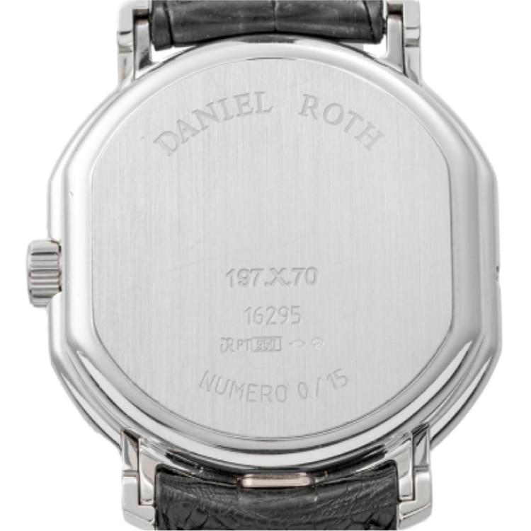
The third change to the reference system took place after the brand was taken over by the Bulgari Group. The first letter of the previous references was removed, leaving a three-digit base to which the letter designation of the generation or design version was added, followed by a two-digit material designation: 10 – stainless steel, 40 – yellow gold, 50 – rose gold, 60 – white gold, 70 – platinum. This gave the shortened version of the reference the following form, for example: Ref. 196.X.40, and it is in this form that the references are most commonly found in modern publications, while the full reference is longer, for example: Ref. 196.X.40.168.CN.BA. As I am aware of the evolution of references, I will mainly use the latter type of reference with a three-digit base part.
The last change in the reference system, which took place in the early 2010s, is a consequence of the end of Daniel Roth as an independent brand. For several years, some models continued to be produced as the Daniel Roth by Bulgari collection, with the Daniel Roth brand name initially appearing on the dials together with the Bulgari name, until the Daniel Roth brand finally disappeared from the dials. Around 2015, Bulgari discontinued the production of watches from the Daniel Roth collection.
A notable complexity in examining the development of the Daniel Roth collection is the lack of visible consecutive case numbering, as we find on the watches of many Swiss brands. Such numbering is found on the watches of the third period of the brand’s history and ranges from around 10,000 to 22,000, which corresponds well with current estimates of Daniel Roth’s production volume of around 1,000 pieces per year on average.
The evolution of the Daniel Roth logo
Despite all the changes in the history of the brand that have accompanied the change of ownership and management models, the brand’s logo has only undergone one significant change. You could call it insignificant as it only affected one letter, but that’s not how I would see it, and I’ll explain why below.
Mk1, the original version of the logo, which first appeared in 1989, remained largely unchanged until 1999 and even later, apart from minor differences in typography. I believe that Mr. Roth and the brand as a whole did not attach much importance to these minor variations, as the style and spirit remained the same in any case. The Mk1a logo has an unusual wavy outline, which emphasizes the special design of the dial of the Tourbillon Ref. 187 and 186.
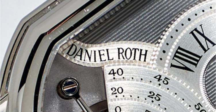
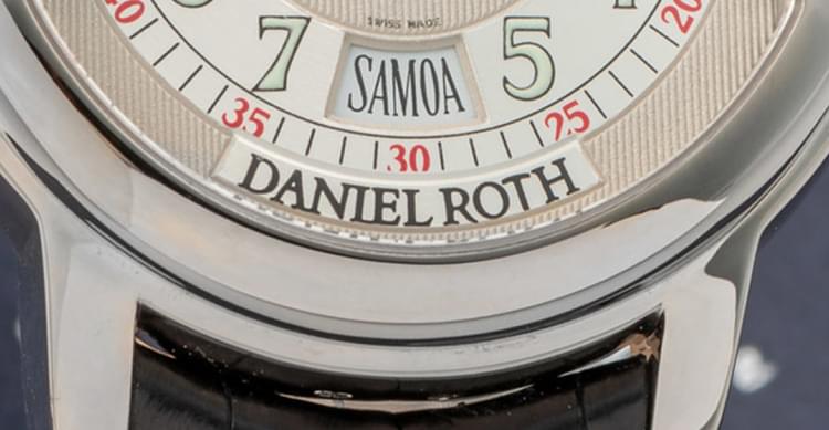
Thus, the wave-shaped Mk1a logo was followed by the arc-shaped Mk1b logo, which first appeared on the dial of the Chronograph Manual Ref. 2147 in 1990, exactly the same on the Perpetual Calendar Automatic Ref. 117 in 1993, and then on many other models launched before 2000. Note that each time the arched logo harmonizes perfectly with the double-arched design of the Daniel Roth case. However, on many models launched before 2000, the brand designers were quite free in the design of the Mk1b logo, both in terms of the width of the letters and the density of their arrangement. There is no clear pattern here, so I will confine myself to mentioning this fact.
The Mk1c logo on the Retrograde Ref. 127, which was launched in 1991, stands out from other logos. On this watch, it is located at the bottom left of the dial and is bent downwards to form the mirror image of an arch. But that’s not all the differences: the font of this version of the logo is compressed, which is in stark contrast to the wide and rather freely arranged letters of the Mk1b logo.
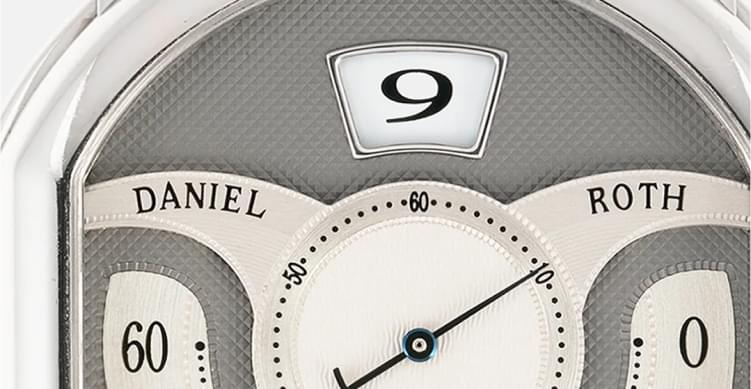
The list of logo variations does not end there. On the Papillon 10th Anniversary Ref. 317 from 1998. We find an unusual variation of the logo with two arches – Mk1d, with “Daniel” and “Roth” placed on different sides of the dial, with each word on its own arch.
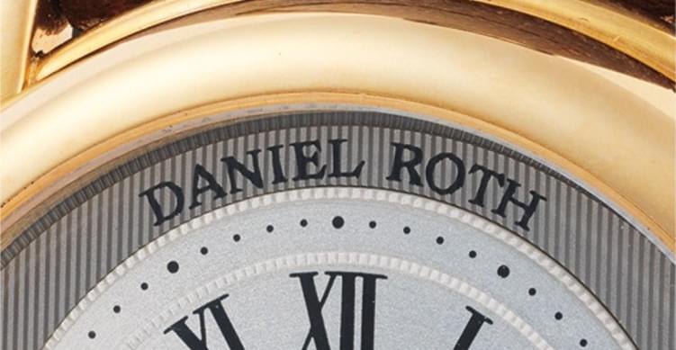
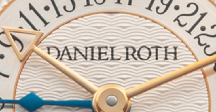
As I have already mentioned, the Mk2 logo differs from the Mk1 logo in only one letter. It is the letter T, which is drawn without serifs instead of with serifs as in the original logo font. Most importantly, the upper stroke of the T has a arched shape – just like the counterweight of the seconds hand on some Daniel Roth watches, especially chronographs, where we find a pair of such hands.
An obvious reference to the double-arched shape of the Daniel Roth watch case makes the design coherent and therefore particularly impressive. As far as I could find out, the Mk2 logo first appeared on the rare Moonphase Power Reserve Millenium Edition Ref. 357, which was released in 1999 to celebrate the upcoming year 2000. Interestingly, this edition was produced with the new logo version before the brand was acquired by the Bulgari Group. Normally, it is reasonable to associate the change of corporate identity with the appearance of a new owner, but in this case the change of logo took place beforehand.
It is also worth noting that many watches designed before 2000 and produced later bore the Mk1 logo well into the 2000s. Some of the most notable examples of the Mk1 logo being used on watches produced in the 2000s include the Ref. 447 automatic chronographs.
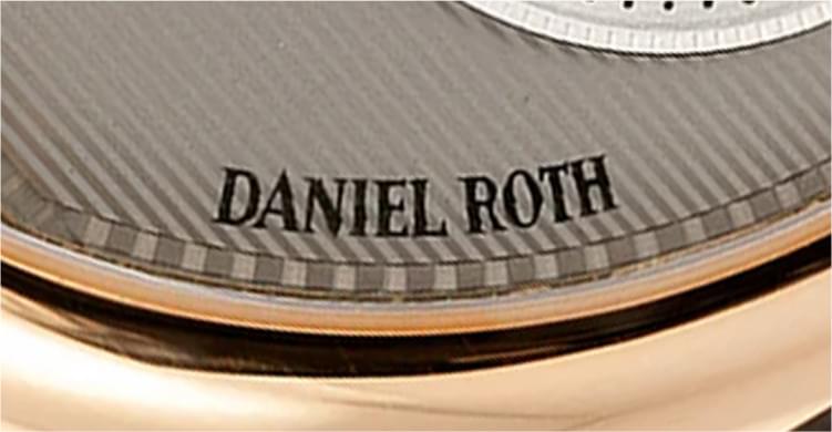
The Mk2 logo has a number of variations that are consistent with versions of the Mk1 logo. The single-arched Mk2a logo first appeared on the Millenium Edition Ref. 357 in 1999, while the Mk2b logo in the form of an inverted arch can be found on the Metropolitan Ref. 857, which was introduced in 2000. The double-arched Mk2c logo first appeared on the Tourbillon 8 Jours Double Face Power Reserve Ref. 197.X in 2002. In 2003, the last – straight (for the first time straight logo in a Daniel Roth watch) – Mk2d version of the logo was finally born, which we see on the dial of the Tourbillon Retrograde Date Power Reserve Ref. 196.X.
In the development of the new 2024 edition of the Daniel Roth Tourbillon watch, Souscription Tourbillon Ref. DR0011YG-01, the brand has returned to the wave-shaped Mk1a logo. The logo has a slightly different style, so we should call it Mk1a2. I’d like to point out that I find some unfortunate changes in the design of some characters that change the graphic appearance of the original version of the wavy logo. Specifically, the upward curved tail of the R letter, the visually foreshortened A letter, and the overly heavy E letter. When I compare the new Mk1a2 logo with the original Mk1a logo, I can’t imagine the reason for these changes, because I don’t think they add any value.